Wednesday, April 25, 2007

Nurbs


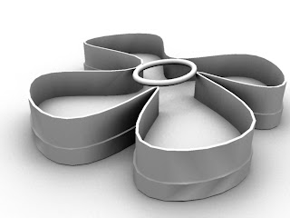
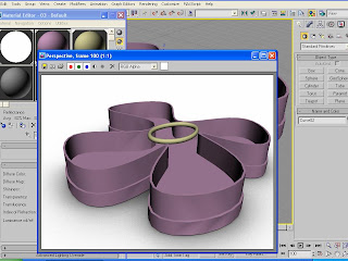
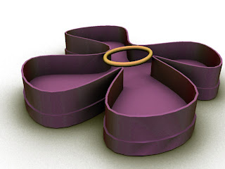
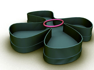
Nurbs, which stands for Non-Uniform Rational Basis Splines, is an option in the 3D program Autocad Viz. Nurbs are known as tools that model surfaces and curves. I wanted to make a four leaf clover, so I began by placing points on the page, which made curves. The four leaf clover was flat so I proceeded to the shell command and the uv loft surface, which gave my object depth. Once I finished making the clover, I rendered it. I messed around with the ambient occlusion command and sent it to Photoshop. I used the multiply command and mixed it with another color render that I had worked on by using hue. The images above show what I created!

Monday, April 16, 2007

Talks Frans Lanting


Talks Frans Lanting: A Lyrical View of the Earth
This video shows the great story of our earth being formed into what it is today. Lanting gives us an idea of the possibilities of how the formations on earth occurred. As Lanting's work shows, the earth's surface was molded by fire billions of years ago. This was followed up by the formation of oceans that was caused by heated geysers that produced water all over the world. Since this time, water has been the basis of all life on earth. Ages later, the water at the poles of the earth froze which caused the shaping of earth's edges. As the earth has aged since its beginning, life has gradually grown more and more complex. Plants and animals have diversified from very simple organisms that were here at earth's beginning. “Growing up became a lifestyle.” Earth's development makes for an amazing story that Frans Lanting is able to legitimately tell by using interesting facts and images. I absolutely loved the video and the ideas that Frans Lanting shared on the evolution of life.

“The whole animal world today lives on a stock pile of bacterial oxygen that is cycled constantly through plants and algae. And their waste is our breath and vise versa. This earth is alive and it’s made its own membrane, we call it atmosphere. This is the icon of our journey and you all here today can imagine and will shape where we go next.” – Frans Lanting

Talks Jeff Han


Talks Jeff Han: Unveiling the genius of multi-touch interface design
I watched this video on Jeff Han, the creator of a multi-touch computer screen that has the potential to take over the computer mouse. Han made the multi-touch computer screen with high resolution at a low cost and most importantly, very scaleable. The most interesting aspect of it is what you can do with it. There is no manual necessary; it’s all interaction within the screen and makes things do exactly what you expect. In the demonstration, Han starts off with showing the audience a lava lamp, then goes through a process of photo-editing. The open source version of Google Earth was my favorite feature. Han started off with the earth and zoomed in from different views and showed how the multi-touch screen could see through 3d very quickly. NASA uses the open source version of Google Earth and I think that’s really interesting and reliable. “This is the way we should be interacting with machines from this point on” said Han.

Thursday, April 12, 2007

Revit


Revit is an Autodek program that I used to design a building. I followed a long tutorial that guided me through the steps on how to use Revit. The whole process took a good amount of time, but I definitely think it was worth it. There was a lot to learn about the program, but the tutorials made it easier on me. I feel like I have a good grasp on how Revit works but there's a whole lot more I could learn for it. I use to only work with AutoCad when designing things, but thanks to this assignment, my options have grown a lot. I feel like I will be using Revit a lot more often and the advantage of knowing the program is great!

Wednesday, April 11, 2007

Visual Mind


Visual Mind is a program designated to help you in your daily work, whether your purpose is business or personal related. Visual Mind is a program whose purpose is to help when organizing thoughts and ideas. It's like the simplest program to use. In my visual mind I made five different categories of important things. From those categories I designated branches that described each one more in depth. I also arranged them by color and shape so it would be even easier to understand whats going on in my life.

Monday, April 2, 2007

Final Project Proposal


For my final project, I plan on working with interior design. I think that interior design is a very important aspect to a building. It establishes conceptual direction and shapes the experience of the interior space. VRay is a program for interior designing that takes photorealistic renderings. I want to design, through VRay, either a living area or a game room that would be found in a house for a family. For now, I plan on studying the program through research, tutorials, and examples so I can get familiar with it. Overall, I would really like the outcome of my project to be worthwhile. A lot of time will be spent on this project, but I hope that the results of my work turn out great so I can use it for my portfolio!

Sketchup

It has been almost two semesters since I first started working on SketchUp but I have yet to get more familiar with it. Though I have done a couple of tutorials and know the basics of the program, I wanted to get more acquainted with it. Searching around the SketchUp Google Tutorials website, I found a tutorial that caught my eye.

Textures: Using Photos will teach you how to distort images so they match surfaces in SketchUp. Through the usage of moving simple pins found in each corner of any image, one can easily stretch the image to the corners of any model and when all four pins are correctly placed, the photograph will be distorted to fit the geometry that you picked.

I really like this tutorial because I had no idea that this feature could be done in SketchUp. It is nice to know that any image that I pick can be transferred and rearranged to fit into a symmetrical form within the program. The example that the tutorial used was really cool. Everyone watch it! Also, there are other tutorials for more basic texturing in the same SketchUp Google website found at the top of my blog.

Thursday, March 29, 2007

Departure Lounge


Departure Lounge is the 2007 National Architecture Conference in Melbourne, Australia. There are two streams of sessions at this year’s conference, which include the Lounge stream and the Integrated Practice stream running April 19-22. The Lounge stream focuses on individual architects on certain topics and The Integrated Practice stream will focus on BIM (the use of Building Information Modeling. The conference will consist of speaker presentations, tours that look at commercial and residential buildings, Supa Tutes and Pecha Kucha Night.

Wednesday, March 28, 2007

Grad School

Although this is my first year in college, it is never too early to start thinking about grad school. Grad school is really important to me. Since I was young, I knew that I was going to finish school with the highest degree possible. It’s a very serious decision and so far I’m thinking about going to The University of Texas. There are a lot of things to consider when picking what school to attend. I want to go to Texas because their architecture is also really good. They have an architectural interior design program that I would love to go into. I know that Texas is A&M’s biggest rival, but when everything is set and done, I am just looking for what’s best for me. Doing grad school is the best idea because there are more job offers and now a days everyone goes through it. I am pretty sure that I wouldn't be happy with myself if I didn't go through with it. Texas is not a sure thing, but it's definitely in my mind. For more information on The University of Texas Grad School, click here.

CARPOOL


I have been doing some research throughout the semester and I think I want to join CARPOOL. CARPOOL, which stands for Caring Aggies R Protecting Over Our Lives, is a designated driver club. It is safe and reliable for all students in the Bryan/ College Station area. The rides are free and non-judgmental, all you have to do is call the number 693-9905 found in the back of your student ID. The reputation of CARPOOL is very high. I have a lot of friends that call CARPOOL because it’s very convenient and safe. Students at A&M trust and love CARPOOL. I think CARPOOL is the smartest idea the school can have. The program runs during the weekend. The program is really cool and I know that I will be working for a good cause. I love helping people and what better way to do it than CARPOOL! For more information on CARPOOL, click here.

Monday, March 26, 2007

Artfest


I have decided to enter two of my works into the Artfest. The first one is a picture that I took of my brother during Christmas break when we were visiting the family in Mexico. The family gets together every year and plays a game of "the veterans vs. young boys" baseball. My brother was just hanging out and I really liked the way he was posing so I took the picture without him even knowing. I really like the way that it looks in black and white. The second one is an 11x14 poster board "LOVE" drawing that I colored with pastels. I made it last semester to show contrast in colors and I like the way that it turned out. The word love is "hand spelled".. haha. No but it really was my hand!

College Schedule


This is the new schedule that I created for the Architecture courses that I have taken and will be taking at Texas A&M for the previous, current and following years. Microsoft ExCel is a good program that I use to organize my things. It's very easy and efficient. Though I have made my schedule, I am pretty sure things are going to move around and change. Although it is not final, I hope to follow it as close as possible!

Wednesday, March 7, 2007

Building

For this assignment, I was to create a structure using Autocad Viz 2007. I wanted to design a building that was interesting and different. I used the box and cylinder to put together the structure of the building, then I used the convertible mesh to select the polygons in the cylinder and deleted half of them to make the final design. I also used the modifier called lattice for the window mullions. To render it, I used ambient occlusion.

Next, I added color to represent the materials of the building. I changed the ambient, specular level, glossiness, reflection, and self illumination to represent the glass, show transparency, and the illumination of the building. I put both images of the building into Photoshop. I used a blending tool multiply, which blended them together.

Finally, I changed the hue of the building four different times to show the variety of color choices the building can have. To show scale, I added two people.


This has been by far my favorite assignment. I really liked the way that the process evolved and the end result of my design. I learned a lot more about Autodesk Viz and I find it more efficient to use. My design was based on a building that I would like to see in the city. The glass is a wall that surrounds the actual concrete building and I think it gives a good architecture look to it. I'm proud :)

Monday, March 5, 2007

Skyline


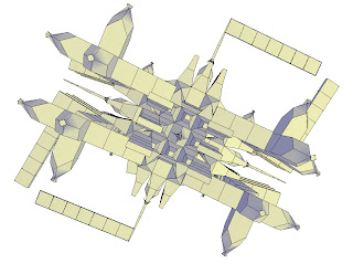
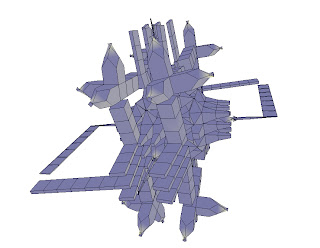
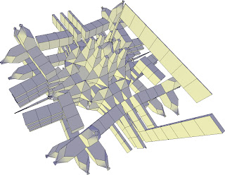
For this weekend’s assignment, I was to design something in TopMod that would later become a paper model. I decided to make a skyline. I saved it as an obj file and opened it in Pepakura. Pepakura is a program that allows you to make a paper model from a 3d data, like the skyline I made in TopMod. Pepakura is really easy to use. It unfolds your 3d model so you know exactly where to bend, cut and attach it together. I even went to the point of adding the numbers so it would let me know exactly where to match things up with. After Pepakura, I saved the new document and opened it in Photoshop so I could color it. I went with different shades of blue and added white spots to create the design of office windows. I printed this out and made my cool skyline!

Wednesday, February 28, 2007

WMMNA


I found the blog site We Make Money Not Art really cool and interesting. All of his articles seemed to be easy worded, informative with nice pictures. I think I liked the blogs mainly because they talked about things that I haven't ever read about. It really enhanced the articles because he actually visited a lot of the places and talked to people that he blogged about. His layout was very nice and caught my eye because I like the color pink and gray. He/she really seems to spend a lot of time and gives quite an effort to make his/her blogs good.

One of his/hers latest blogs that I liked was the "Post Patman". It talked about a place that he/she visited called the Palais de Tokyo in Paris. The “Nouvelles du Monde Renversé” is an exhibition of what seems to be random things made into sculptures. The picture that caught my eye the most was the chickens made of chocolate. I really liked the way he talked about the exhibition in his articles.

When I was in elementary school I remember making food sculptures. If I remember correctly, I made a carriage like the one in Cinderella, out of a pumpkin and other vegetables. I also made a car and flower out of fruits. I think this is why I liked this blog a lot. It was definitely my favorite thing to do, I mean really, a sculpture that you could eat? Best idea ever!

TopMod

:)


TopMod is a program that allows you to make shapes that you couldn’t make in any other modeling program. By adding and deleting edges, you can create or delete handles, holes can be opened or closed, etc. The program is very convenient and easy to use.

I began my model with an octahedron. I used extrusion and the different commands within it to come up with an idea. For a while, I just tried to make the model evened out by adding the same type of commands in each section of it. Once my model was finalized, I messed around with the high genus modeling command to see if my model could look better, but I ended up sticking with the normal one I had before. My model doesn’t really look like a certain object but I liked the way that it was formed. I then took my object to Autodesk Viz to use ambient occlusion.

Ambient occlusion is a shading method used in 3d programs which helps add realism to an object. It does this by taking into account reduction of light due to occlusion. Ambient occlusion is calculated by casting rays in all directions of the surface.

The programs that I have started to use this semester are efficient, handy, and easy to use. At first they are a little complicated because I have to start from the bottom and learn how to work everything within the program. I have done a couple of tutorials and googled some ways to help me but really it’s all about practice. I have worked mainly with AutoCAD and have noticed that these other programs take less time to use. I like them.

Monday, February 26, 2007

Giancarlo G. Perossa


Education:
• The Art Students League of New York
Life Drawing with Leonid Lerman, 2006
• Texas A&M University, College of Architecture
Visualization Science Laboratory graduate study, 2004-2005
• Texas A&M University, College of Architecture
Bachelor of Environmental Design, 2001, Summa Cum Laude
• (Took Fairey freshman year and Maffey third year)
Work Experience:
• Gensler, Houston, Texas (2006-Present)
• Alley Theater, Houston, Texas (2006)
• The Juilliard School, New York, New York (2005-2006)
• Derek Stenborg, New York, New York (2005)
• Texas A&M University Energy Saving Laboratory, College Station, Texas (2005)
• Imago Dei, LLC, Houston, Texas (2003-2005)
• Museum of Cultural Arts, Houston (MOCAH), Houston, Texas (2003)
• Lazarides Design, Houston, Texas (1999-2000)
• Texas A&M MSC University Plus, College Station, Texas (1998-1999)

The first thing that I pointed out when I walked into the art show was that the paintings had a lot of red color in them. During class that day, we had talked about red being a very noticeable color. I asked Giancarlo why he chose to emphasize the red in his paintings and he said that the color stood out more than others and it is more vibrant when put with other colors, like black. He picked red though because of the Tuscany feel. Tuscany uses very warm colors. His work was very architecturally painted. After his wife finished graduate school, they moved to Italy for a little over a year. I asked him if he recommended study abroad for a semester of the internship. He didn’t do study abroad but he recommended it because the architecture that we do resembles architecture in other places. It’s a good idea because it really makes you understand everything more. For example: going to a firm, the architect will be more presentable and look more intellectual because of the background experience. Instead of just saying that you know of something, you can say that you have been there. He told me that it’s important to show your strongest points and really emphasize what you are good at in your portfolio. It will be easier for the firm to realize what your strong points are and what you will be good to do for them. I asked about being ranked number one in the College of Architecture at Texas A&M. He responded by saying that he worked hard and got the hard teachers because there was some teachers that weren’t good and a lot of his friends took them. In the long run he definitely benefited the most because he felt prepared. He said that he went into class knowing he would do his best and would be successful. He said that students shouldn’t take a lot of classes, like 15 is too many, 12 is a good amount so you can make all A’s. On a side note, Giancarlo knows Spanish and Italian. He is very successful, winning a lot of awards for his work. I really liked his show. He was an extremely nice guy, cool and laid back, very informative.
Aggieland Saturday


Last Saturday I volunteered to help the Architecture College at Texas A&M work Aggieland Saturday. At the beginning, I was scheduled to work the first shift for a total of three hours. A couple of girls and I met up at Langford and got ready for a hard day at work. I had gotten an email earlier on from Michael White that gave directions in what to do when I worked my shift. My job was to take the visitors and give them tours throughout all three of the Langford buildings. I was a little nervous at first because I felt like I didn't know much about certain departments within the architecture program and I didn't want people to get the wrong impression. Everything turned out great. I learned a lot more about the college myself through the tours I gave. I think that I did well informing the parents, as well as the students about Texas A&M, Architecture College, and college in general. I actually ended up working both shifts which was over six hours. It was nice being on the other side giving the information instead of receiving it. Aggieland Saturday was very successful and I think I did a good job of informing the future students.

Wednesday, February 21, 2007

Collage


The assignment was to use Combinformation to make a collage about architectural things that I liked. The program was really cool. It was so easy to work with and the variety of images that came about was nice. The steps to working this was typing three keywords, then images would pop up and all I had to do was pick which ones interested me and put them in my collage. The three keywords that I picked were architecture, landscape and mansions. Both architecture and landscape are very general words, but I still wanted to search them to see what images I could find. Mansions was the random keyword I wanted to search. I did this because I was curious to see what kind of images came out of the word. Mansions usually have something interesting and unique about them, so I wanted to see what kind of designs came about from the search. I found some really cool landscape images and photography in general that I liked. I picked my favorites and incorporated them into my collage. Here is what I ended up with.

Monday, February 19, 2007

Menu Design


Matt Nolan and have been working on our menus together. Though we have the same basic format, our layout is a lot different. I decided to add a rainbow stone background because I think that color is very important. The titles for each section in the menu is a color from the background light. I used "Chick": 30pt. for the titles and "Croobie": 12pt. for the items in the menu. I think that the white font for the items in the menu is a good choice because it's very easy to read. I tried to keep everything spaced out so that there's no confusion. I want to keep this a one page menu (front,back). Here's what I have.

City Lights


I was searching through some magazines at Evans Library and I found this really interesting article over lights. The layout of the article was really nice. The article was divided into two sections, the first top half was the title and reading, and the bottom second half was the picture that the article was over. I think that there should always be something in an article that catches a persons attention. For this article, it was definitely the picture (colors within the picture). The reading was very easy. The article had two main rows of reading. There was a lot of space between each section of the reading so it was very easy to understand. The font type was fairly normal with a couple of different colors to combine with the colors on the picture.

Urban Land Magazine is a "30 page special report on retail markets for multinational investors, and how new retail designs driven by "de-mailling," urbanization, and societal influences are changing how malls engage their communities in the US, Europe, and Asia." I looked into the January 2007 issue on the Back Page. City Lights talks about how six members of the British Design Partnership (BDP)attempted to change how people view and what they think of the Manchester, England by using 45 torches and 110 light-emitting diodes. The conclusion was that if they achieved this by only using 20 minutes of battery power, the possibilities of permanent lighting installations are endless. The "guerrilla lighting" event was a campaign to show how lighting has an impact on the cities in which people play, work, and live.
Wednesday, February 14, 2007

Menu Ideas

I have a set idea on how I want my menu to look like in the end, but I decided to mess around with the color schemes and see how a single color background worked with a regular light font. I think that even though a regular color background could work, I don't like it. It doesn't look very appealing and it seems a little unprofessional. I want to find a picture background that also has a good color scheme. As far as the menu, I want to keep just a single page, front and back. The front will contain drinks and the back will have the food and desserts. One of the menus that I thought was really cute was from a coffee shop called "Common Grounds" in Waco. I plan to emphasize that idea into my own menu.
Architecture's Future


Monday, February 12, 2007

Michael Meredith

Michael Meredith is the Assistant Professor of Architecture at the Harvard University Graduate School of Design. He wrote Notes for those beginning the discipline of architecture. Some statements that I really liked from the reading:

“You need to find a problem or methodology or technique that is smarter than you. Then this problem becomes what you use and compulsively repeat, instead of something that is already past, and it serves as your creative device”.

“Eventually you decide to scrap the entire endeavor, because you just can’t make your thoughts stick together into a beautifully constructed whole. You think maybe you should write your bildungsroman, something useful like a survival guide or Cliff Notes or an introspective user’s guide or something closer to Rousseau’s Confessions. But how could anyone possibly represent the recursive self-conscious mess of architecture? In the end, all you’re left with are your pathetic “Notes for those beginning the discipline of architecture””.

On a side note, I am taking Fairey’s studio this semester. At the beginning of the semester we each had to pick a word that described ourselves. The word that I picked was “exuberant”, so from then on I have had/ will have to incorporate my word into every project. I just finished my exuberant black and white composition this weekend and Meredith mentions exuberant compositions, which I find extremely cool.

Author Information:
Michael Meredith is Assistant Professor of Architecture at the Harvard University Graduate School of Design. He teaches in the architecture core design studio sequence.
His professional practice engages interdisciplinary discourses, ranging from art to technology, producing a spectrum of design work which includes furniture, products, sound, speculative architecture projects and residences in New York, Ontario, Texas, and California. Recently he was a finalist for the design of the Pentagon 9-11 memorial and the PS1/MoMA Young Architects competition. In 1998, he was a winner of the Young Architects Competition at the Architectural League of New York. His design work has been published in Architecture, Architectural Record, Casa Brutus, Competitions, McSweeney’s, the New York Times, Oculus, and Surface. His writings have appeared in A+U and Artforum. In 2003, he was a resident at the Atlantic Center for the Arts, and in 2000 he received a residency at the Chinati Foundation in Marfa, Texas.
He received his BArch from Syracuse, his MArch with distinction from the GSD, and the Frederick Sheldon Traveling Fellowship from Harvard University. In 2000, he was awarded the Muschenheim Fellowship from the University of Michigan, where he taught in 2000-2001. From 2001 he was an assistant professor of architecture at the University of Toronto Faculty of Architecture, Landscape and Design—where he was a corecipient of a Canadian Foundation for Innovation grant—before joining the GSD faculty in 2004.

Wednesday, February 7, 2007

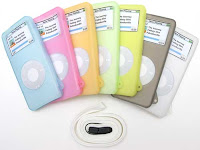
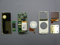
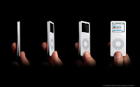
Thoughts on Music


I read over the articles Thoughts on Music by Steve Jobs and Apple's Jobs call for DRM-free music by EE Times, an online Global news. Both, my sister and I, own Nano iPods. The music that I download comes from LimeWire. It's free and convenient. All I have to do once I download the music is transfer it to iTunes and when I connect my iPod to the computer, it automatically updates the newest stuff. I'm not really sure how much space each file from LimeWire takes up on my computer, but I do know that when I add a song to iTunes, it compresses it so that there's more space available. I know of a couple of people that do buy the songs from the iTunes Store but they only have a couple of songs. I honestly don't think I would ever do that. Why pay when you can get songs for free? There's way too many songs that I want to download and paying $.99 for each song would definitely add up in the future. My opinion is probably way wrong but until someone makes it impossible to download free songs.. I'll probably continue to use the regular programs.